By Kristan Reynolds, The Invading Sea
Today marks the seventh annual Show Your Stripes Day, an event dedicated to raising awareness about human-caused climate change through “warming stripes” graphics that display temperature trends for the past 100-plus years.
Warming stripes were originally created by Ed Hawkins, a climate scientist at the University of Reading, to serve as a “simple visual representation” of the progressive warming of the Earth fueled by human activity, according to Climate Central.
Now, Climate Central releases warming stripes graphics annually with data for 195 U.S. cities and 49 states, along with overall U.S. and global trends. Through the #ShowYourStripes global campaign to raise awareness about climate change, warming stripes are featured on landmarks, TV and phone screens and even buses.
“We really want to help frame that story between climate warming, extreme weather events and the associated health and safety, as well as economic impacts in people’s communities,” said Lauren Casey, a meteorologist for Climate Central.
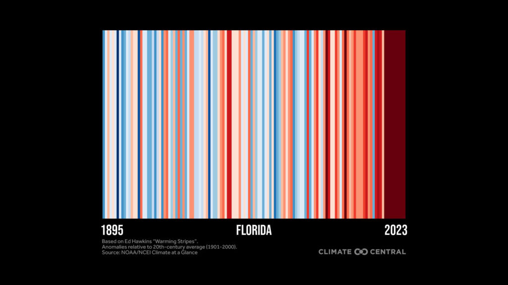
With each blue stripe representing a year with a colder annual average temperature and each red stripe representing a year with a warmer annual average, the graphics can clearly display the trend of global warming through the mostly blue to mostly red shift that occurred globally.
Beyond educating the public on climate change and its impacts, Show Your Stripes Day also emphasizes the importance of discourse and action toward a more sustainable future.
“The No. 1 thing you can do individually about climate change is to talk about it,” Casey said. “Talk about it with your friends, neighbors, family members, and demand conversations also from the media and from your local politicians.”
Organizations and casual social media users alike are starting those conversations under #ShowYourStripes on X, Instagram, Tikok and other platforms. Many simply talk about what Show Your Stripes Day is or post screenshots of warming stripes for their cities — some have even performed skits.
“Climate change isn’t some kind of nebulous future thing that’s happening halfway across the globe,” Casey said. “It’s happening right now in our backyards, and we’re seeing those impacts in extreme weather events, particularly.
“So really, people having the awareness that climate change is impacting things, maybe as simple as prolonging the allergy season, and you’re sneezing and sniffling; to more severe consequences, like this extreme heat wave, which unfortunately will likely result in heat-related illnesses and potentially heat-related mortality.”
Kristan Reynolds is a Florida Atlantic University senior majoring in multimedia journalism and minoring in communication studies who is reporting for The Invading Sea during the summer 2024 semester.
Sign up for The Invading Sea newsletter by visiting here. If you are interested in submitting an opinion piece to The Invading Sea, email Editor Nathan Crabbe at ncrabbe@fau.edu.